


Originally Posted by SPRTN308

This. There's no real point doing a Herman imitation if it doesn't imitate Herman's long-range visibility. To do that it needs contrast.
|


This. There's no real point doing a Herman imitation if it doesn't imitate Herman's long-range visibility. To do that it needs contrast.
Member, Team Norinco Plinko. Will spot for beers.
This post is copyright (c) rdelliott. My express written permission is required for any reproduction or use other than discussions on canadiangunnutz.com.

North Connaught Rifle & Revolver Association, is still using them for Service Pistol Matches.
Don't know where they get them from...or, how many they have left.
P.P.C.eer.
``Stay in the light...keep your target in sight"

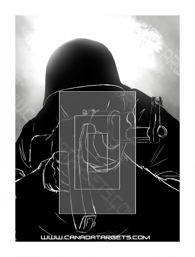
The image is still a relatively non-descript blob of a single colour. Keep the nice line work (I really like it) but add some more high contrast areas to the dude and keep the scoring rectangles as line and not a shaded area.
This is my take:
Notice how the finger makes a nice distinct aiming point in the middle of the centre scoring ring? It's kind of like aiming at the wrist on a figure 11.
A2 flash hider aficionado.

I'd make the middle square and outer square really light, almost white. Then have the second square really dark (so the centre would be white, next square black, next one white then outside the boxes like it is.


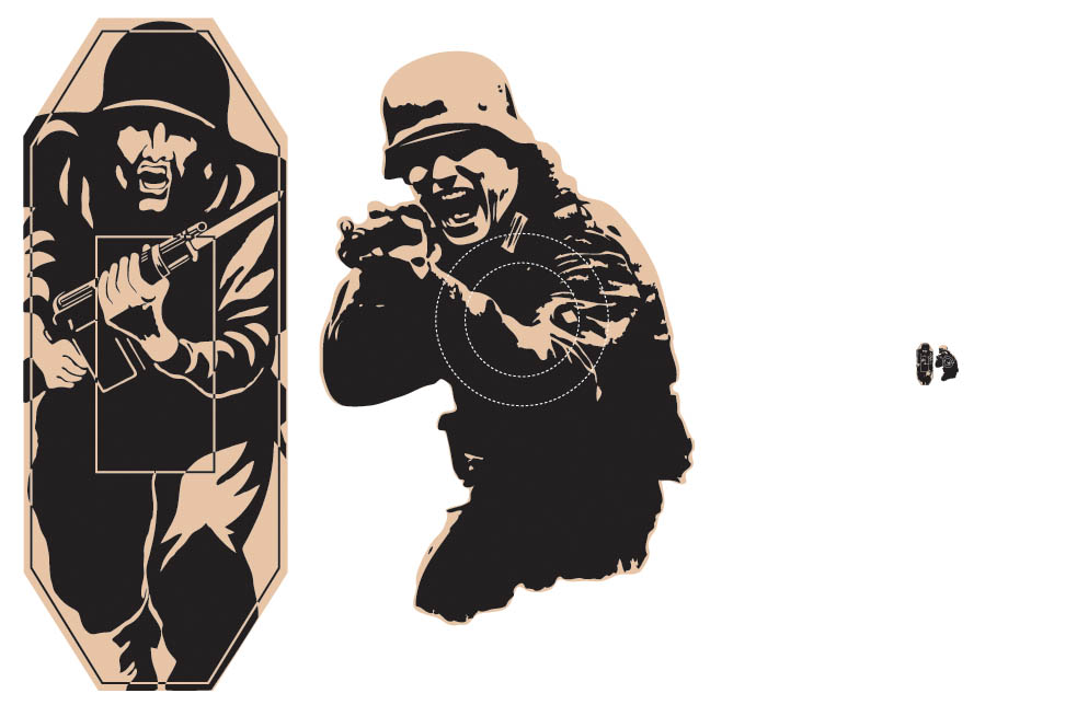
+1....what is so great about the design of the original herman is that the contrast they built into the image was done in such a way as to have two distinct aiming points that are visible at long range. The aiming points are what's important. In the below example, notice how at even long distance you can make out white areas that are strategically located in the center of the scoring zone (remember that the face of the storming norman is also a scoring zone in the figure 12). For comparison I've also included a sample of the design of my "herman" type target I'm currently making from cardboard, using design principles I'll describe in a sec.
I love to make my own targetry, and the feature described above, while conceptually simple, for me anyway has been difficult to incorporate as I'm not the most skilled illustrator. As such, most of my older targets have wound up being a simple silhouette with no distinct aiming points and consequently they are not as good as herman. Recently though I've been making a stronger effort and have landed on a principle or two that seems to make it easier.
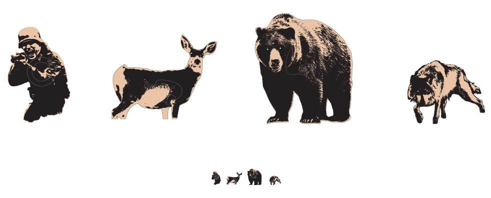
1. The image can be printed only with black ink against either a white or cardboard background
2. There can be no shades of grey...the image must be polarized.
3. Approximately 2/3 to 3/4 of the image must be black, the remaining white. This seem to make the white areas stand out more.
To illustrate the concept, here are some examples from what I have been working on. You will notice that the concepts have been implemented with varying success.
Good luck! I can hardly wait to see what you come up with....
Cheers,
Brobee
So who prints your targets?
Very nice.
Mark
'Politics is the art of looking for trouble, finding it everywhere, diagnosing it incorrectly and applying the wrong remedies.' Groucho Marx
As they are for my own personal use, I contract out fabrication of both my paper and cardboard targets locally here in Calgary.
Last edited by Brobee; 09-13-2012 at 01:47 PM.
Something that just occurred to me is that Classic Herman(tm) is not a drawing of a charging man; it's a high-contrast pattern, visible at long ranges, that's been cleverly tweaked to look like a charging man.
In other words, the original illustrator probably started with a pattern that was visible at range, I.e. two super-posed white blobs on black background (the face and center hand) over side by side black and white patches (the legs) and morphed them into humanoid shape and added facial features and the rifle.
At longer ranges, you can't see the details, but the face, hand, and forward thigh against the dark humanoid shape are what give the aiming cues. Once you get out to 500 (the farthest out I've ever shot a Herman), you're just aiming at the overall dark shape.
I'm not an illustrator, but maybe starting with the contrast features and morphing might be the way to go; think impressionistic high contrast outline rather than a drawing...
Member, Team Norinco Plinko. Will spot for beers.
This post is copyright (c) rdelliott. My express written permission is required for any reproduction or use other than discussions on canadiangunnutz.com.

I think you might be right. The scramble-pattern version seen earlier in this thread is someone's take on making the same high-contrast target, without making it look too human-like.
When you look at the needs of a target, it has to be visible, first-off. And if you want to have a scoring area, you need a contrasting visual reference seen from as far away as your aiming device (Fig 11 and 12 were designed for iron sights, up to hundreds of yards). The wrist on the charging figure, and the face on the head-figure.
This is less about artwork, and more about a contrasting target first, and "what" the target represents, second.
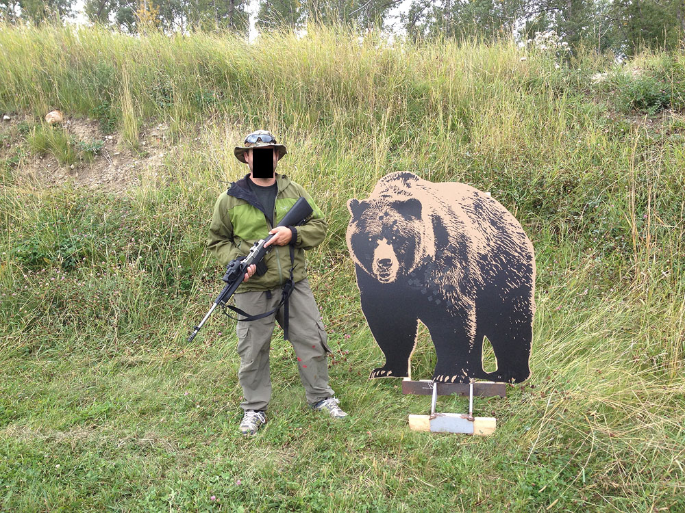
Canada Targets is getting pretty close to a good, usable target, and the recent poster with his own (frikken scary looking bear!!!), are coming along nicely towards good, long-range targets that won't offend anyone except those who would be offended anyway. I'm liking this thread.


 Posting Permissions