Canada Targets
Expired Business
- Location
- Saskatoon, Sk
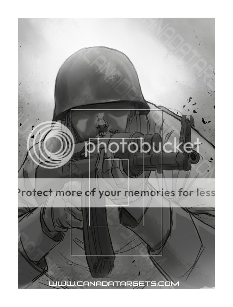
We are leaning towards the rectangle scoring rings


There is one in every crowd...
It wont be called a Herman, it is a working title.
It's the reason why we can't use the name Bloggins as a generic name in the CF anymore. Someone finally joined up with then name.

That's a good point. I'm sure the above target (while a very nice design) would just be a large grey blob at 300+ metres.


") Ill actually be more incline to buy some if the name hermann is on the target .
Ill actually be more incline to buy some if the name hermann is on the target .