


You are using an out of date browser. It may not display this or other websites correctly.
You should upgrade or use an alternative browser.
You should upgrade or use an alternative browser.
Does Temperature Affect Your 22LR Ammunition
- Thread starter The ROC
- Start date
I've heard from some top rimfire PRS shooters that Eley seems to be less temp sensitive than other brands, will be interesting to see what future videos show.
Not enough shots in this experiment to prove or disprove anything IMO. I've not heard someone argue that temp does not affect performance, perhaps he doesn't see big swings in temps like Canadians do?
Not enough shots in this experiment to prove or disprove anything IMO. I've not heard someone argue that temp does not affect performance, perhaps he doesn't see big swings in temps like Canadians do?
I've heard from some top rimfire PRS shooters that Eley seems to be less temp sensitive than other brands, will be interesting to see what future videos show.
Not enough shots in this experiment to prove or disprove anything IMO. I've not heard someone argue that temp does not affect performance, perhaps he doesn't see big swings in temps like Canadians do?
People re-zero during matches in the spring... start at 8am in -5 and it can be sunny and +15 by early afternoon...
People re-zero during matches in the spring... start at 8am in -5 and it can be sunny and +15 by early afternoon...
Agree. - dan
- Location
- Rural Atlantic Canada
I found this interesting. This fellow has a thorough look at this.
Kevinshoots22 on YouTube
https://youtu.be/MICRqWmndz8?feature=shared
Kevinshoots22 on YouTube
https://youtu.be/MICRqWmndz8?feature=shared
Both videos referred to above use ten-shot strings of chrony data. Conclusions based such small sample sizes are notoriously unreliable, especially with .22LR ammo.
It appears that in general .22LR ammo that's warmer will have somewhat higher muzzle velocities and cooler ammo will be somewhat slower. It remains unclear, however, how much of a temperature increase is required to cause a statistically significant change in MV.
It appears that in general .22LR ammo that's warmer will have somewhat higher muzzle velocities and cooler ammo will be somewhat slower. It remains unclear, however, how much of a temperature increase is required to cause a statistically significant change in MV.
The only thing that changed was the temp of the ammo, not the temp/humidity/etc of the atmospherics being 'shot in'.
Not to mention temp of the barrel
100/200 Mtere Rimfire shoots occur all year at the Mission DRGC.
Some of the matches are shot when the temperature is below zero.
The use of match grade biathlon ammunition is part of the solution but the problem remains testing when the temperatures are lower.
Biathlete shooters are constantly testing their ammunition under colder conditions.
Out matches from November to February may encounter some colder conditions but testing is near impossible.
Finding the right ammo is essentially hit or miss and some luck.
My Cooper has shown a preference for Eley Match Biathlon with a published velocity of 1085 under all conditions.
The Anschutz rilfes and the Remington are used with the standard velocity match grades.
Both videos referred to above use ten-shot strings of chrony data. Conclusions based such small sample sizes are notoriously unreliable, especially with .22LR ammo.
It appears that in general .22LR ammo that's warmer will have somewhat higher muzzle velocities and cooler ammo will be somewhat slower. It remains unclear, however, how much of a temperature increase is required to cause a statistically significant change in MV.
^^^ Agreed.
I give the YouTube guy credit for trying to do experiments and putting in some effort. But it is curious why he did not attempt to answer his own question for his experiment when he had all that digital chronograph data at his fingertips, i.e. Is there a significant difference in MV based on temperature of the ammo?
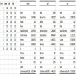
So to help out in answering his primary question, I copied his chrono data by clicking and stopping the video for each shot, and entered this data into Excel. (see table image below). Then I used Excel's "Data Analysis: Descriptive Statistics" tools that can pop out some stats that can help answer the question.
His "control" ammo is not a control, because of course that ammo also has a temperature (!). But I used his terminology for clarity. Also, since the ammo temperatures were not measured and recorded and we have no idea of the temperature differences, its a kinda sorta qualitative experiment-ish. And since the sample sizes were too small, treat all the analysis with skepticism.
Image for the chrono data and Excel's "Data Analysis: Descriptive Statistics" outputs:

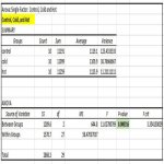
Image below for the ANOVA for all 3 temperature ammo's: The P-value is <0.05, so Conclusion is: Yes there is a significant difference in MV's between the 3 ammo's.

Image below for three pair-wise comparison ANOVA's (control vs cold, control vs hot, cold vs cold). Conclusions:
- control vs cold: P-value <0.05. Yes these are significantly different.
- control vs hot: P-value >0.05. No these are not significantly different.
- cold vs hot: P-value <0.05. Yes these are significantly different.

(EDIT: I think there is a false P-value in the ANOVA for control vs hot. See the next post for a different statistical method).
Attachments

Last edited:
Statistics can "lie", or fool you, especially when sample size is not large enough for the robustness of the specific stats test you chose. The computer will spit out results, regardless if the data is appropriate.
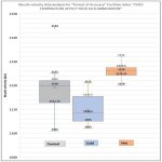
In the above ANOVA's, there is something I don't like, which is the no significant difference between the Control and Hot. I think there is a difference.
So I did a Box & Whisker plot (image below), which in my opinion, is usually better than ANOVA's and other tests of variance for these types of data.

The reason Box & Whisker plots are better for observing sameness or difference for examples like this, is that they are simply the data stacked smallest to largest, and divided into quarters (quartiles) of 25% each. The middle Box is the 25% to 75% group (the 50% middle Inter Quartile Range, or IQR). Without knowing any fancy statistics methods, your eye can intuitively see the general comparison of how similar or different these are.
The median (the exact middle of the data count), is shown with the horizontal line through the box, and the mean is shown marked with an X. These two often overwrite each other, so I deleted the mean text in each box. The median is often the better indicator of the central bulk of the values when sample sizes are small. When you see the median not in the center of the box, that shows a skewing of more values to that side of the box.
The whiskers are the ES (extreme spread), unless one or more of the values is way, way outside the distribution, in which case its shown as an outlier. Outliers are more than 1.5 x the height of the box away from the upper or lower edge of the box.
The data values are shown for the Whisker extremes, the Outlier, the bottom and top of the Box (high and low values of the IRQ).
In this case, the Control group has one crazy outlier. That value is so large that in a small sample size it can mess up the more complicated stats tests. That may be one reason why in the ANOVA, that the Control and Hot were not significantly different. From the B&W plot, its clear to me that they are in fact quite different from each other and in the spread of their distribution. Therefore IMO, I think the ANOVA is a misleading statistical test for this sample size of data.
The Hot ammo has the narrowest distribution which, all else being equal, is likely to shoot less vertical in a match than the two other ammo temperatures. The Cold is not bad either. The Control looks like the poorest performance for MV distribution.
(Other comment: It looks like some of those rounds might be supersonic, in which case they would go through the transonic zone, which might affect how they print on a target at 50 m/yards).
In the above ANOVA's, there is something I don't like, which is the no significant difference between the Control and Hot. I think there is a difference.
So I did a Box & Whisker plot (image below), which in my opinion, is usually better than ANOVA's and other tests of variance for these types of data.
The reason Box & Whisker plots are better for observing sameness or difference for examples like this, is that they are simply the data stacked smallest to largest, and divided into quarters (quartiles) of 25% each. The middle Box is the 25% to 75% group (the 50% middle Inter Quartile Range, or IQR). Without knowing any fancy statistics methods, your eye can intuitively see the general comparison of how similar or different these are.
The median (the exact middle of the data count), is shown with the horizontal line through the box, and the mean is shown marked with an X. These two often overwrite each other, so I deleted the mean text in each box. The median is often the better indicator of the central bulk of the values when sample sizes are small. When you see the median not in the center of the box, that shows a skewing of more values to that side of the box.
The whiskers are the ES (extreme spread), unless one or more of the values is way, way outside the distribution, in which case its shown as an outlier. Outliers are more than 1.5 x the height of the box away from the upper or lower edge of the box.
The data values are shown for the Whisker extremes, the Outlier, the bottom and top of the Box (high and low values of the IRQ).
In this case, the Control group has one crazy outlier. That value is so large that in a small sample size it can mess up the more complicated stats tests. That may be one reason why in the ANOVA, that the Control and Hot were not significantly different. From the B&W plot, its clear to me that they are in fact quite different from each other and in the spread of their distribution. Therefore IMO, I think the ANOVA is a misleading statistical test for this sample size of data.
The Hot ammo has the narrowest distribution which, all else being equal, is likely to shoot less vertical in a match than the two other ammo temperatures. The Cold is not bad either. The Control looks like the poorest performance for MV distribution.
(Other comment: It looks like some of those rounds might be supersonic, in which case they would go through the transonic zone, which might affect how they print on a target at 50 m/yards).
Attachments
Last edited:
Statistics can "lie", or fool you, especially when sample size is not large enough for the robustness of the specific stats test you chose. The computer will spit out results, regardless if the data is appropriate.
(Other comment: It looks like some of those rounds might be supersonic, in which case they would go through the transonic zone, which might affect how they print on a target at 50 m/yards).
It's an excellent point about statistics. They can only be as good as the data and how it's used. In any test with .22LR, a sample size of ten is far too small to provide reliable information.
Regarding potentially supersonic MVs, whether or not some .22LR rounds are faster than the speed of sound isn't relevant or important. Simply exceeding the speed of sound -- which is approximately 1125 fps, depending on temperature and altitude -- doesn't make the rounds less accurate or affect how they print on target.
Transonic turbulence is what may contribute to bullet instability and affect how it prints on target. The transonic zone of speeds is from about 1340 fps down to about 890 fps. Transonic turbulence occurs when some projectiles slow down from supersonic velocities into the transonic zone speeds. In other words, if it's going to happen, it happens when bullets slow down to below approximately 1340 fps.
The vast majority of .22LR ammo don't exceed 1340 fps. In fact, most .22LR bullets spend their entire useful flight time within or below the transonic speeds. Only "hyper velocity" .22LR ammo such as CCI Stingers will have MVs that may exceed 1340 fps, and they are inaccurate because they aren't made to match ammo quality standards.
Most .22LR high velocity ammo isn't as accurate as .22LR match ammo because they aren't made to match ammo quality standards. It has nothing to do with their velocity.
For any reader wishing more information, it was confirmed in 1990 by Robert McCoy that .22LR ammo with transonic zone velocities (from about 1340 fps to 890 fps) doesn't suffer from the increased pitching and yawing that causes the flight instability associated with bullets slowing down into the transonic zone from considerably greater velocities. See conclusion #5, p.11 in Robert McCoy "AERODYANMIC CHARACTERISTICS OF CALIBER .22 LONG RIFLE MATCH AMMUNITION" https://apps.dtic.mil/dtic/tr/fulltext/u2/a229713.pdf
Don't manufacturers keep 1140 -ish as the barrier speed with most keeping their match offerings under that speed which changes occur? or is ther another reason?
There is another reason. Slower .22LR bullets are less affected by wind drift than those with faster MVs. In other words, slower rounds drift less. That's increasingly important as target distance grows. Match ammo for .22LR has historically and typically been used for rifle competition at distances of 50 and 100 and 200 yards.
How slow the ammo should be is another question. Smallbore target rifles used in 3P and prone have usually had longer barrels than many contemporary rifles, such as those used in rimfire PRS. They often have MVs that are lower than many shorter barreled rifles. At the same time, it's worth keeping in mind that an ammo that averages 1050 fps in one target rifle bore can average much less in another -- even of the same length.
I'm not aware of information about it one way or another, but it's possible there may be a relationship between the efficacy or success of producing consistent match ammo that's slower rather than faster.