Something different:

D.
Nice. Professional, clean. I like it.


Something different:
D.
We need to develop a new company logo. Feel free to post some ideas/pictures. If we use yours we will give you some sort of prize...still deciding on the prize.
Ryan
Nice. Professional, clean. I like it.
I really like the backgrounds on these ones. where can I get them as wallpaper for my computer?
 Great work BTW
I am pretty sure that I will be the winner!!!

Another couple options.

 :
:I am pretty sure that I will be the winner!!!
Here is my kick at it. Being a Graphic designer by trade kinda helps as well.
Various size breakdowns for readability. Slogan could also be replaced with the web site address. Colors can easily be swapped.

Another couple options.
 Just came across your logo contest. This is what I do for a living (logo design/brand development). I hope it's not too late for an entry
I am pretty sure that I will be the winner!!!
Hi all! I'm very new to this site
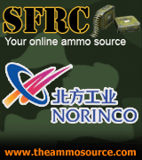
This is designed in vector format. If you like it, I can revise it to your specifications. The concept of this logo is pretty obvious- I used the letters "SFRC" and modified it into a shape of a rifle. I broke down the barrel into sections to make it look like rails. There are 13 sections representing the 13 provinces/territories of Canada. The logo is recognizeable in just plain black and white and in any size. Pefect for print and web use.
Look forward to your comments. Cheers!