












































A year ago I was on the Track Of The Wolf website and looking at the scrimshaw powder horns. What struck me as odd was how BAD the scrimshaw work was. Even the authentic antiques were pretty bad. If ya want one, be prepared to shell out hundreds of dollars - or more!
I decided that even a hare lipped retard like Yours Truly could do a better job, and ordered up a garden variety chit house powder horn to give this scrimshaw hogwash a try personally.
I got the horn last year and went at it...and found out why the artwork sucks on powderhorns. Everything is free-hand; the surfaces are all curves, nothing is flat and sometimes ya need three extra hands to hold the damn thing as you try to carve on it!
I actually got kind of lucky with this one, although you can't really see it in the photo, the tones of the horn material accidentally turned out to shade the young lady's face quite handily. The way the hues move down the horn suggest 'wind' to me, so that is what I tried to go with. Despite the incredibly bad artwork I did, the damned thing actually has a sense of 'atmosphere' to it, if ya know what I mean. I can't capture any of this with the camera, it is the damndest thing I have ever seen.
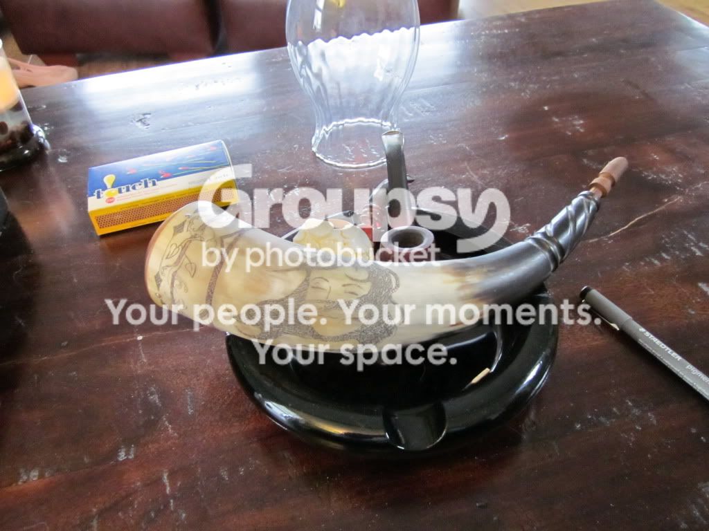
I am usually my own worst critic; but when I hold this stupid thing and look at it, I actually take some pride in how it turned out. Am I being objective here? Don't be polite, unleash your inner filthy critic!
It certainly won't win any art shows...but I think I need to have another go at this...
I decided that even a hare lipped retard like Yours Truly could do a better job, and ordered up a garden variety chit house powder horn to give this scrimshaw hogwash a try personally.
I got the horn last year and went at it...and found out why the artwork sucks on powderhorns. Everything is free-hand; the surfaces are all curves, nothing is flat and sometimes ya need three extra hands to hold the damn thing as you try to carve on it!
I actually got kind of lucky with this one, although you can't really see it in the photo, the tones of the horn material accidentally turned out to shade the young lady's face quite handily. The way the hues move down the horn suggest 'wind' to me, so that is what I tried to go with. Despite the incredibly bad artwork I did, the damned thing actually has a sense of 'atmosphere' to it, if ya know what I mean. I can't capture any of this with the camera, it is the damndest thing I have ever seen.
I am usually my own worst critic; but when I hold this stupid thing and look at it, I actually take some pride in how it turned out. Am I being objective here? Don't be polite, unleash your inner filthy critic!
It certainly won't win any art shows...but I think I need to have another go at this...