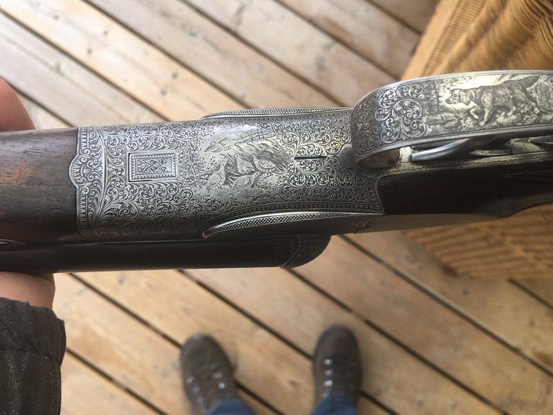
The choice between partial and full coverage engraving might have had a cost component, or it might just be style and the evolution of styles. Has anyone seen a percussion gun with full-coverage engraving beyond pictures of guns built as exhibitions for world’s fairs? I’ve seen many pinfires, and none have the kind of total coverage engraving found on vintage hammerless sporting guns. Some run close, but the open foliate scroll on actions lends itself to leaving areas uncovered for best effect. With the steady movement towards smaller and smaller scrolls, I can see how it might be tempting to cover the entire surface in engraving. On Canvasback’s Lindners, the engraving on the 12 is wonderful, but the 20 is downright exquisite in its smaller scrolls and more detailed borders.
The first breech-loaders offered a much greater ‘canvas’ area for the engraver’s art than existed on muzzle-loaders. There was more metal to ‘soften,’ more joins to hide. Then, when hammers disappeared altogether, you had an unobstructed view of the top, sides and underside, perfect for full-coverage adornment and the new tight scrolls. Sadly I don’t have such a gun as has been pictured so far, but I hope we’ll see more such guns in this thread.
On to another engraving subject, the makers’ names, and how they appear in relation to engraving. The most common scheme has the maker’s name on the locks and the barrel rib, with the rib usually carrying the address as well. Other standard configurations include the name and street address on the rib only, the name and city on the lockplates, and, in the case of ‘guild’ guns, having no identifying marks at all. How the name is displayed on the lockplates with respect to the engraving appears to vary in three ways. The first is when the name appears almost as an afterthought, squeezed into the space left by the engraver. Here is a Boss & Co. single, where the name looks like no special place was left for it.
In a low-cost gun with less artful engraving, there is more blank space to include the name, and the effect is less cramped, as in this example by Frederick Gates of Darby:
Next is when space is left by the engraver for the name, or name and city, as in this nicely balanced example by Charles Frederick Niebour of Uxbridge:
Some engravers incorporate a cartouche to surround the maker’s name, as in the example of Ashcroft’s Dougall. More common is the utilization of a banner in the engraving design for the maker’s name. We’ve seen examples in this thread so far, such as the Pape and the Arizaga. Such banners might be straight, as (again) in this Harris Holland:
...or curving, as in these two examples, another Harris Holland, and a Cogswell & Harrison:
There are undoubtedly other ways to display names. Let’s see more examples!