












































Figure this may be the best CGN forum to post this in, being the home for "the lovers of the old ways" .....
I am in the process of getting quotes to have a custom flag made which will be a facsimile of the type of "Canadian Red Ensign" normally made and flown from about the mid-1870's through to the late 1890's. I think it will be a nice bit of kit for my military re-enactment activities (which concentrate on that period) and also for use at Cowboy Action shoots.
I am posting (here and elsewhere) to ask whether anyone else - clubs, individuals, or whatever - might also want such a flag for their use. To keep costs reasonable, as well as in the interests of both convenience of use and durability, the flag would be of "modern" printed nylon or polyester construction - i.e. not the sewn cloth type which would actually have been made back then. (It is still possible to have such flags made, but of course the cost skyrockets!)
A bit of historical background ......
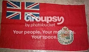
In 1868 a Red Ensign was adopted by Canada - not as an official "national flag", per se (..... in fact, the Union Jack remained Canada's "official" flag until well into the 20th Century .....) but rather as a sort of unofficial flag to emphasize Canadian nationhood, as distinct from simply being one of many components of the British Empire. As a result, this red ensign was frequently flown on government buildings and elsewhere. The form adopted in 1868 incorporated a shield which displayed the Coats of Arms (at that time) of the four original Provinces in Confederation - i.e. Nova Scotia, New Brunswick, Quebec and Ontario, and in its simplest form looked like this -
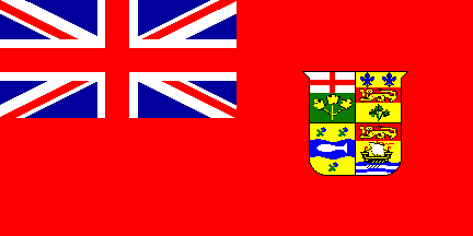
The legislation authorizing the above design was never changed until the first version of the Red Ensign most of us are familiar with was adopted a few years after the Great War, so this 1868 version remained the authorized Red Ensign until 1922 ...... notwithstanding the entry of new Provinces into Confederation, starting with Manitoba in 1870, until there were nine Provinces when Alberta and Saskatchewan were established in 1905.
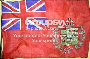
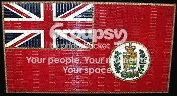
However, In actual practice, flag-makers usually incorporated their own revisions to the shield by adding new Arms as Provinces joined Confederation. As a result, after 1873 the Red Ensign actually flown usually looked like this - i.e. including Arms for Manitoba, Prince Edward Island and British Columbia. This is one of the fancier versions, with the shield surmounted by the Imperial crown, a gold beaver below the shield, and a wreath of gold maple leaves surrounding the whole works. Sometimes the shield and other devices were even centered in a white circle .....
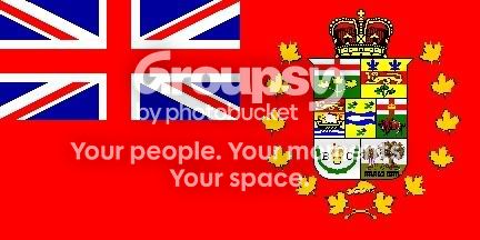
However, all that embellishment makes the flag much too "busy looking" in my view - and simpler forms incorporating only the shield, or a crown-topped shield, were made.
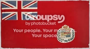
My preference is for a facsimile of one of the simpler forms which were made back then. I am particularly partial to the crown-topped shield, without more, like this:

(This is actually a small-scale version of the artwork I have produced for this project. Proportions have been changed from 1:2 to the 3:5 sizing most flag-makers now utilize .... to avoid "extra charges".)
Anyway ..... back to my question - would anyone like to get such a flag?
I can get a "one-off" custom flag made for my own use for about CDN$110, but it seems the cost per unit goes down if more copies are ordered. I seem to be having a hard time getting specific price information on multiple copies of the flag, so far. When I asked about that with the outfit which had quoted CDN$110 for a single flag, they just responded that two made to the same design would be US$75 each (not sure why they switched currencies in mid-stream.) I now have to go back to them to ask about unit pricing for greater quantities (i.e. 5 flags, 10 flags, or more). I am also going to make inquiries with some US-based custom flag-makers, who have information on their websites indicating a sliding price scale as greater numbers of a particular flag are ordered.
I should mention that a modern-made flag (of the official1868 design shown first above) is currently available from "Dominion Regalia" here in Canada .... but their price is CDN$215 per flag, plus shipping!
I am in the process of getting quotes to have a custom flag made which will be a facsimile of the type of "Canadian Red Ensign" normally made and flown from about the mid-1870's through to the late 1890's. I think it will be a nice bit of kit for my military re-enactment activities (which concentrate on that period) and also for use at Cowboy Action shoots.
I am posting (here and elsewhere) to ask whether anyone else - clubs, individuals, or whatever - might also want such a flag for their use. To keep costs reasonable, as well as in the interests of both convenience of use and durability, the flag would be of "modern" printed nylon or polyester construction - i.e. not the sewn cloth type which would actually have been made back then. (It is still possible to have such flags made, but of course the cost skyrockets!)
A bit of historical background ......
In 1868 a Red Ensign was adopted by Canada - not as an official "national flag", per se (..... in fact, the Union Jack remained Canada's "official" flag until well into the 20th Century .....) but rather as a sort of unofficial flag to emphasize Canadian nationhood, as distinct from simply being one of many components of the British Empire. As a result, this red ensign was frequently flown on government buildings and elsewhere. The form adopted in 1868 incorporated a shield which displayed the Coats of Arms (at that time) of the four original Provinces in Confederation - i.e. Nova Scotia, New Brunswick, Quebec and Ontario, and in its simplest form looked like this -
The legislation authorizing the above design was never changed until the first version of the Red Ensign most of us are familiar with was adopted a few years after the Great War, so this 1868 version remained the authorized Red Ensign until 1922 ...... notwithstanding the entry of new Provinces into Confederation, starting with Manitoba in 1870, until there were nine Provinces when Alberta and Saskatchewan were established in 1905.
However, In actual practice, flag-makers usually incorporated their own revisions to the shield by adding new Arms as Provinces joined Confederation. As a result, after 1873 the Red Ensign actually flown usually looked like this - i.e. including Arms for Manitoba, Prince Edward Island and British Columbia. This is one of the fancier versions, with the shield surmounted by the Imperial crown, a gold beaver below the shield, and a wreath of gold maple leaves surrounding the whole works. Sometimes the shield and other devices were even centered in a white circle .....
However, all that embellishment makes the flag much too "busy looking" in my view - and simpler forms incorporating only the shield, or a crown-topped shield, were made.
My preference is for a facsimile of one of the simpler forms which were made back then. I am particularly partial to the crown-topped shield, without more, like this:
(This is actually a small-scale version of the artwork I have produced for this project. Proportions have been changed from 1:2 to the 3:5 sizing most flag-makers now utilize .... to avoid "extra charges".)
Anyway ..... back to my question - would anyone like to get such a flag?
I can get a "one-off" custom flag made for my own use for about CDN$110, but it seems the cost per unit goes down if more copies are ordered. I seem to be having a hard time getting specific price information on multiple copies of the flag, so far. When I asked about that with the outfit which had quoted CDN$110 for a single flag, they just responded that two made to the same design would be US$75 each (not sure why they switched currencies in mid-stream.) I now have to go back to them to ask about unit pricing for greater quantities (i.e. 5 flags, 10 flags, or more). I am also going to make inquiries with some US-based custom flag-makers, who have information on their websites indicating a sliding price scale as greater numbers of a particular flag are ordered.
I should mention that a modern-made flag (of the official1868 design shown first above) is currently available from "Dominion Regalia" here in Canada .... but their price is CDN$215 per flag, plus shipping!